Tiles
Organize the content in tiles of equal width.
The <Tiles> is a layout component which is based on CSS grid system.
Usage
<Tiles> serves as a versatile container, ideal for constructing panels, cards, lists, and other content components that organize and group information. They automatically wraps children to a new line if the space given is not enough to show the <Tiles> in one row.
It's possible to display the items with some spacing through space prop or set a minimum width for all items inside <Tiles> with tilesWidth prop.

Grand Avenue Ballroom

Maple Court Theatre

Broadway Community Center

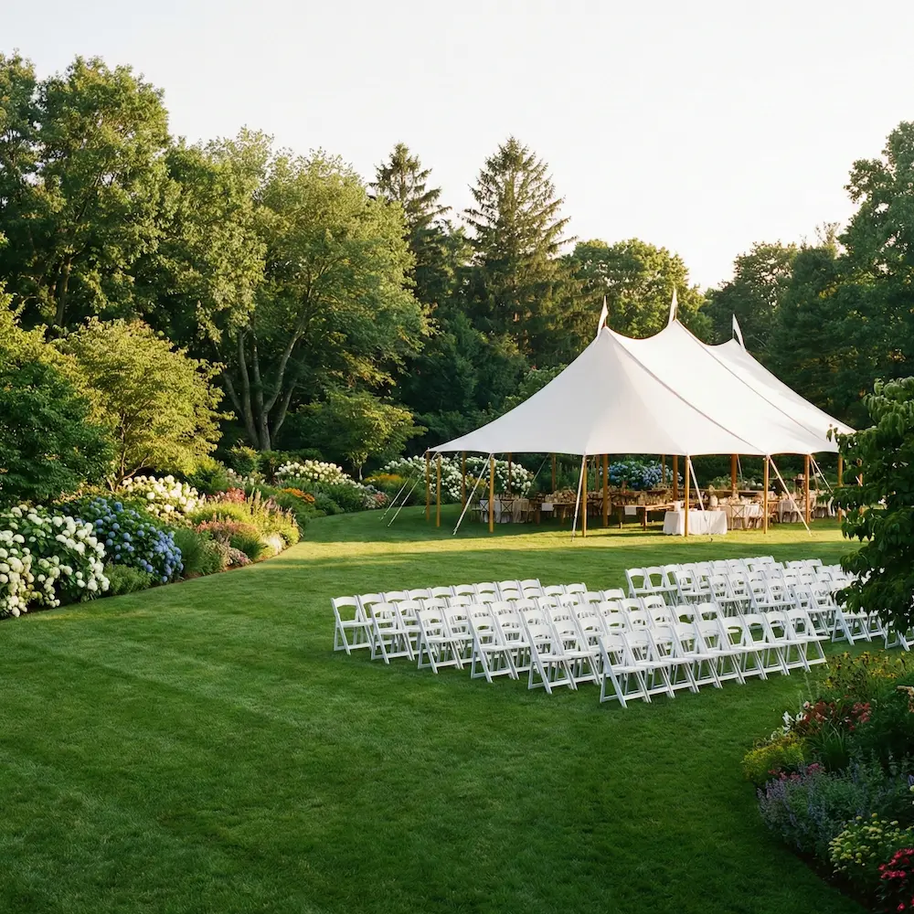
Hillcrest Open Pavilion
Bloomfield Garden Lawn
import { venues } from '@/lib/data/venues';import { Card, Headline, Stack, Text, Tiles } from '@marigold/components';export default () => ( <Tiles tilesWidth="200px" space={2}> {venues.slice(5).map(venue => ( <Card key={crypto.randomUUID()} p={4}> <Stack space={2} alignX="center"> <img src={venue.image} alt={venue.name} width={200} height={200} /> <Headline level={3}>{venue.name}</Headline> <Text>{venue.description}</Text> </Stack> </Card> ))} </Tiles>);Equal heights
If you need to have the items in the <Tiles> take the same height, you can use the equalHeight property, which is a boolean value that can be used to size the items of the <Tiles>. In this case, all items adopt the size of the largest card, making it essential when you want all items to match the largest child's dimensions.
import { Card, Tiles } from '@marigold/components';import { Rectangle } from '@/ui/Rectangle';export default () => ( <Tiles space={1} tilesWidth="200px" equalHeight> <Card> <Rectangle height="100px" /> </Card> <Card> <Rectangle height="100px" /> <Rectangle height="100px" /> </Card> <Card> <Rectangle height="100px" /> </Card> </Tiles>);Stretch width
Using the stretch property will make the tiles fully responsive. Meaning, they will distribute available width between them while not getting smaller than the given tilesWidth.
import { useState } from 'react';import { Card, Stack, Switch, Tiles } from '@marigold/components';import { Rectangle } from '@/ui/Rectangle';export default () => { const [stretch, setStretch] = useState(false); return ( <Stack space={2}> <Switch label="Toggle stretch" onChange={() => setStretch(!stretch)} /> <Tiles space={2} stretch={stretch} tilesWidth="100px"> <Card p={2}> <Rectangle height="100px" /> </Card> <Card p={2}> <Rectangle height="100px" /> </Card> <Card p={2}> <Rectangle height="100px" /> </Card> <Card p={2}> <Rectangle height="100px" /> </Card> </Tiles> </Stack> );};Props
Tiles
Prop
Type
Alternative components
Columns: It should be noted that
<Tiles>is used for children with the same width. If you want to set different widths for the children use<Columns>instead.Grid: If you need more custom control over the layout, you should use
<Grid>component instead.